
Overview
SFO is a multi-generational family office with its head office in Stellenbosch, South Africa. The firm has stewarded family wealth across generations and jurisdictions for twenty-five years. It had reached a point where its identity needed to match the scale of the practice and align with its business strategy.
We partnered with SFO to carry the brand into its next chapter. This meant refining an existing mark down to its essential form, and building a visual language around one belief: every generation must be treated as the first.

The Challenge
SFO’s work is measured in decades. Many client relationships run twenty-five years or longer, often crossing two or three generations of the same family. The brand needed to carry that same weight. It had to sit comfortably alongside legal counsel, trustees and international specialists.
The brief was direct: transition the brand into the next generation. An evolution that could hold the standing of an established, trusted practice while making clear the firm was built for what comes after the current generation.
There was a second challenge, quieter but just as real. SFO operates across two distinct geographies: Stellenbosch, South Africa and Zurich, Switzerland. Each carries its own visual history and its own expectation of credibility. The brand needed a way to hold both without either one reading as an afterthought.


Our Solution
We started with the belief at the centre of SFO’s practice: each generation that follows must be given the standing of a first generation. Free to define its own priorities and build t heir own legacies.
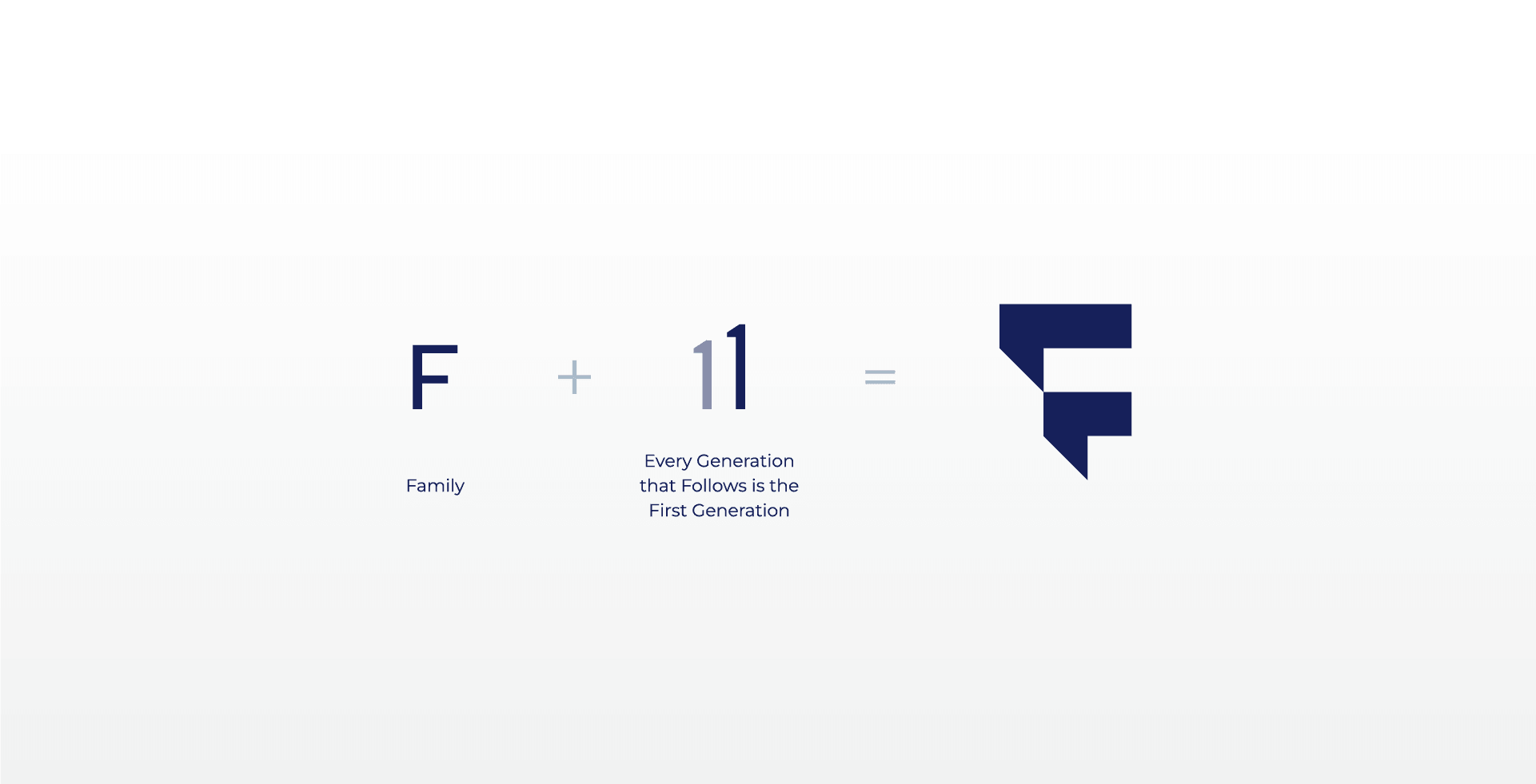
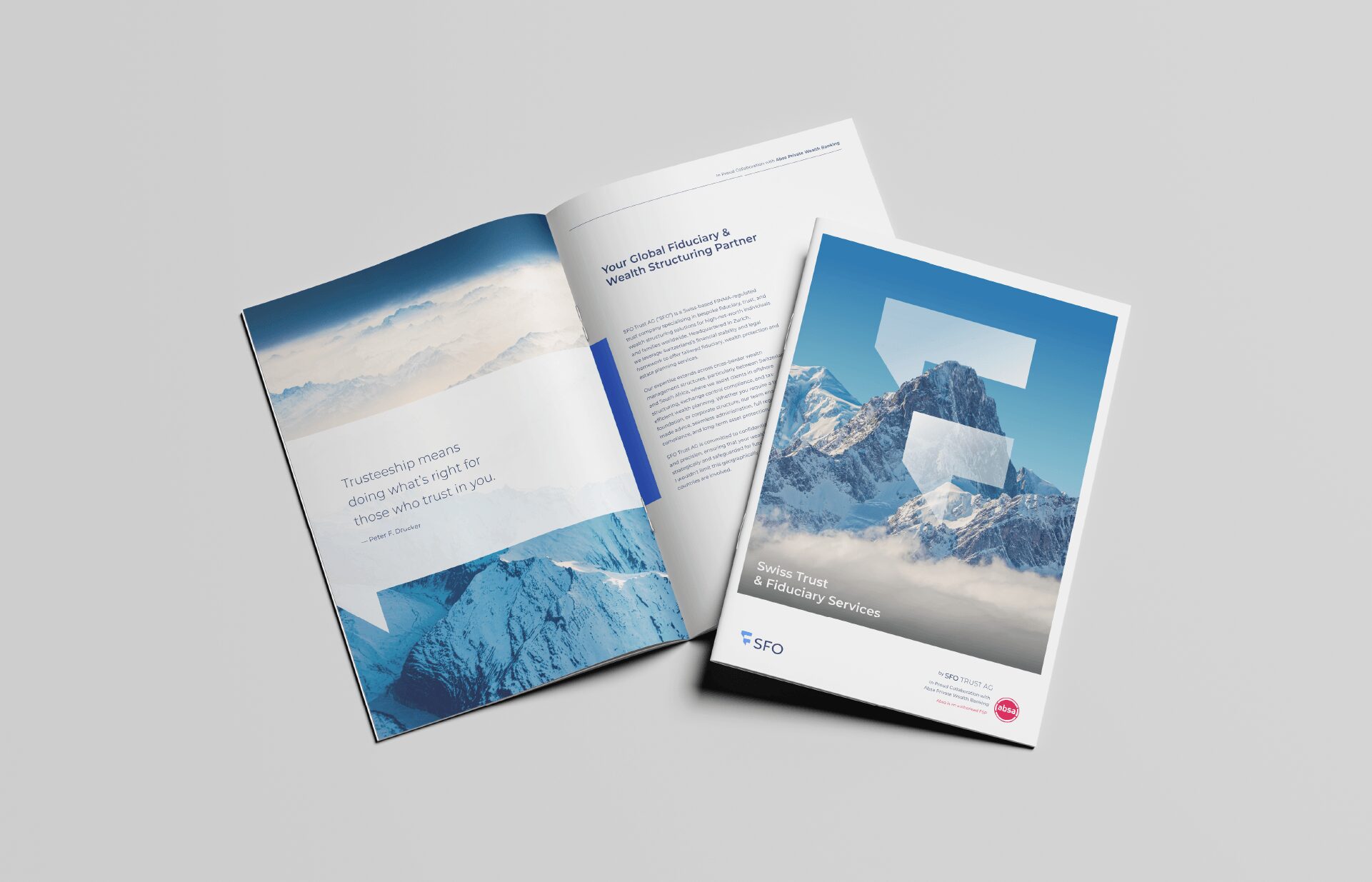
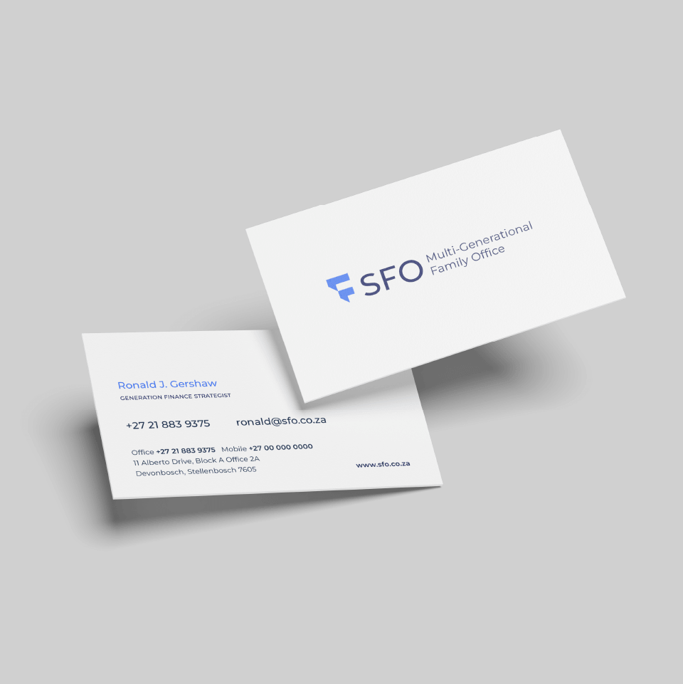
We worked with the SFO team to refine the brand mark to its essence. The emblem is built from the letter “F” and the number 1, repeated to express the idea of generations in its simplest form.
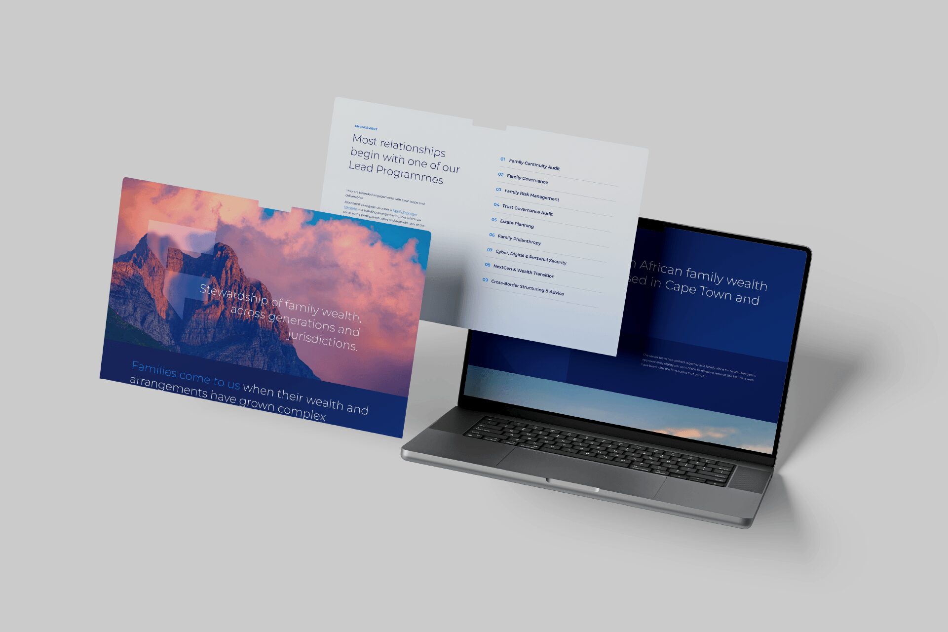
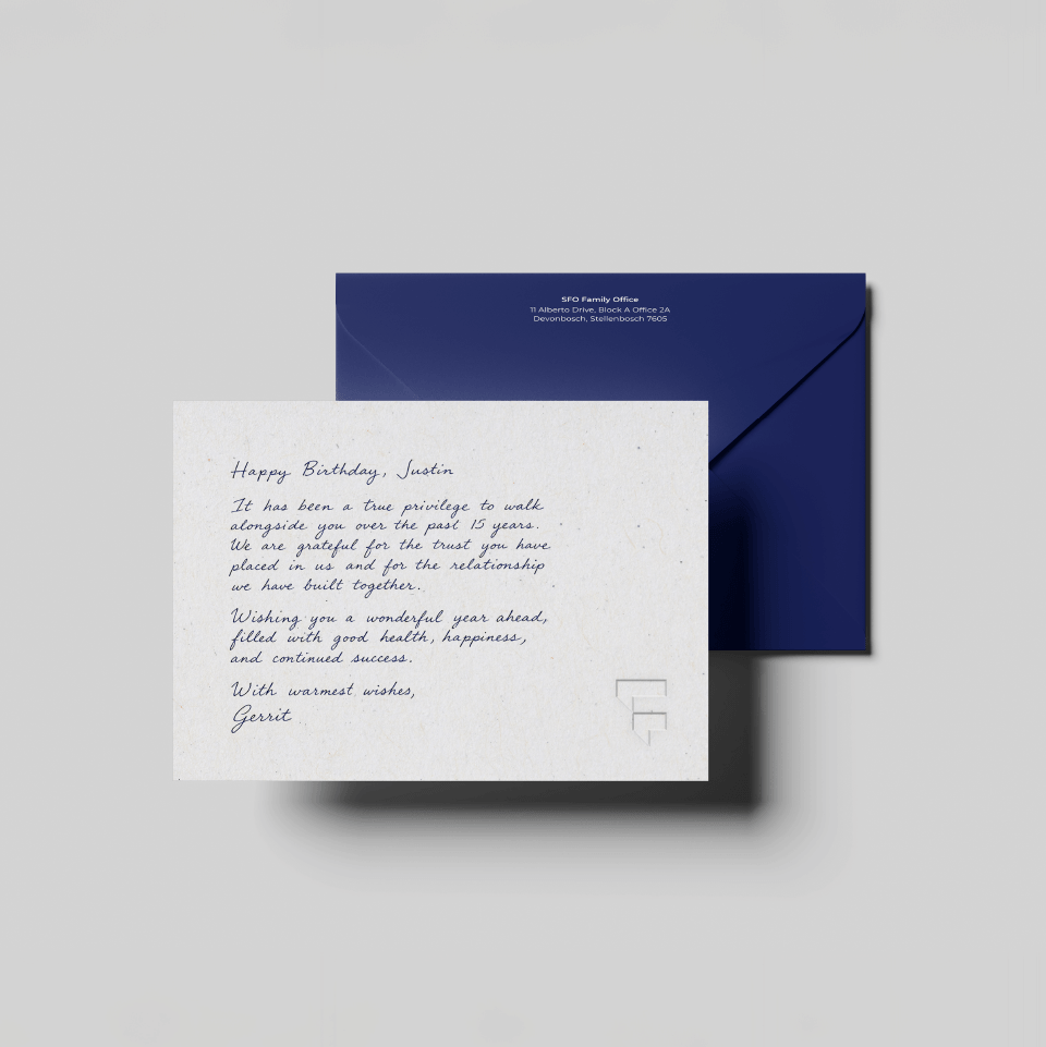
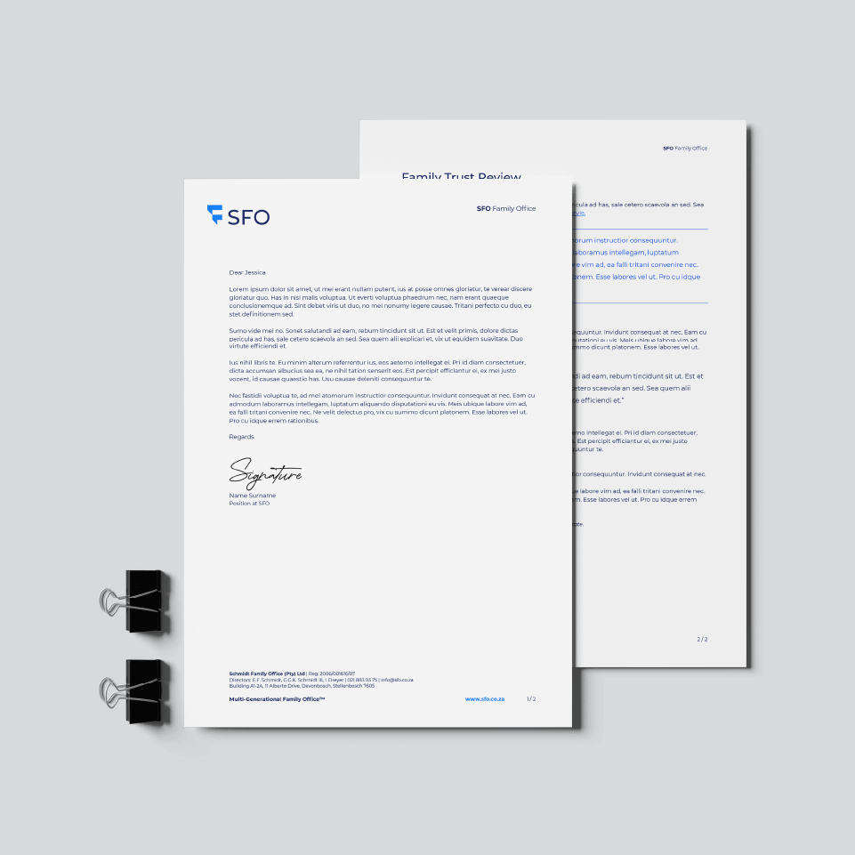
Alongside the emblem, we built a condensed logotype and a two-tone colour system: a formal, deep navy paired with a lighter, more approachable blue. This positions the brand between credibility and warmth. The typography and graphic language stay quiet on purpose.
To resolve the geography question, we built a photographic language around the mountain ranges that frame each office: the folded peaks of Stellenbosch, and the sharper, glacial lines of Switzerland. Both are colour graded the same way, so the two locations read as one brand while each still keeps its own character.


Unique Challenges and Opportunities
The main challenge was restraint. SFO’s work is technical, substantial, and built on long-standing relationships. We needed to stay quiet yet build gravitas through well timed visual weight. We stripped the mark and the system back to only what was necessary, on the basis that clarity signals credibility to these families more than embellishment ever could.